UX Design Considerations for Acquisitions: Standalone Products
Making acquisitions part of your UX family - A model, a menu and
addressing standalone products. (Part 1 of 3)
A major project in the last year at ICE Mortgage Technologies was to provide the User Experience point-of-view of how the company should consider integrations of products across the product line. I presented the resulting deck to C-level leadership, and they asked it to be pushed down to product management and for them to use it to plan. I then led workshops with the product management teams to determine an integration path. The content of these articles, with my VP's comments on the business, is a result of the activity.
I led a number of workshops with VPs of product management, their teams, and engineering to understand how technologies should be considered. One of the more complex ones was how automation would impact the whole ecosystem.
A very fulfilling activity was to run workshops with teams to help them unpack a problem and set strategic direction. For these, we had them talk about the area's background and contexts that affect deciding direction. From there, we listed issues and how hard they would be to solve or implement. Then we had product management and engineering discuss phases and the requirements for the phases to be successful.

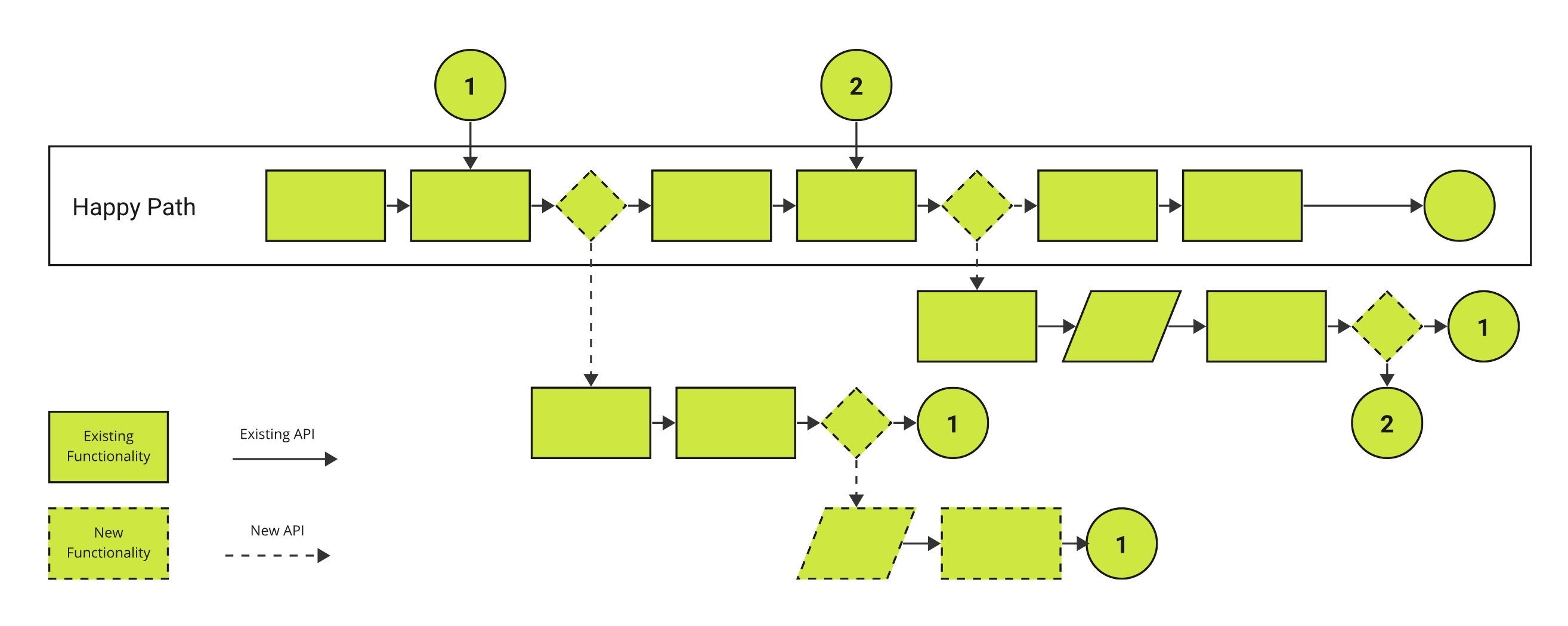
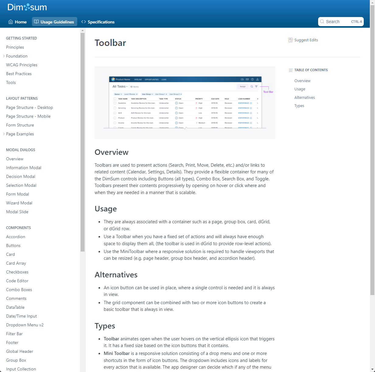
I worked closely with my friend David Abkowitz on Dim Sum, ICE Mortgage's design system. I wrote much of the usage guidelines. An important aspect was putting component alternatives early in a guideline so users would understand to choose the right one before thinking about configuring one that was not appropriate.
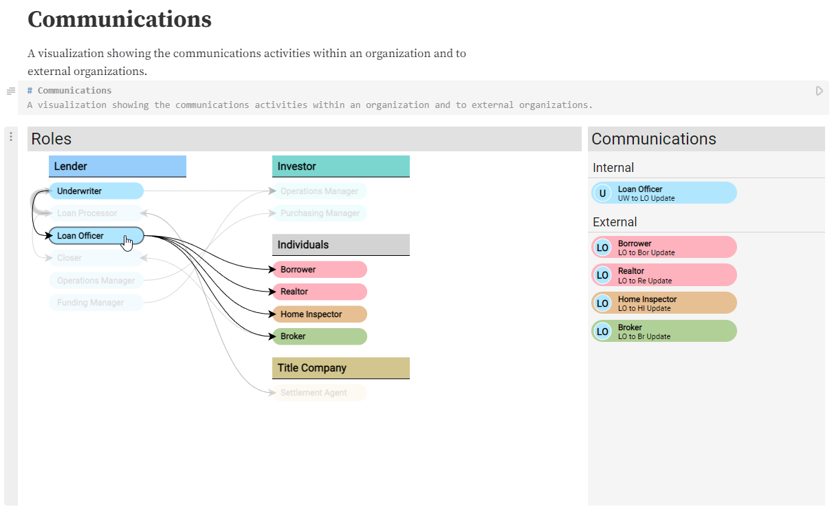
The mortgage user journey has a complex communications network. I created an interactive visualization to help people understand it. While building it in Observable took extra time, doing so made it easy to update as we learned more about the ecosystem.
I was originally hired to design the company’s first analytics product, a visualization application of mortgage data. Insights was a multi-year project whose user experience I architected and led the user experience production.
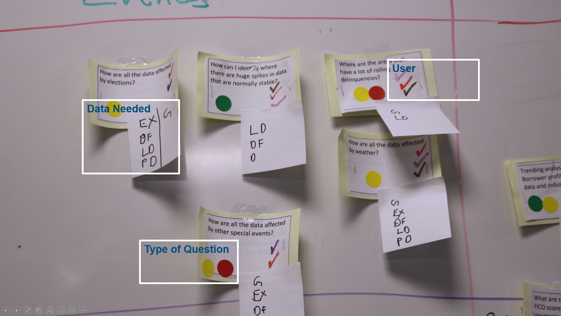
I worked with my friend and user researcher Kathi Olsen to organize the data so we could decide what comments users wanted answered.
I selected a set of ways we could organize the data, including the analytical direction, data required, and which roles would be interested in the results.
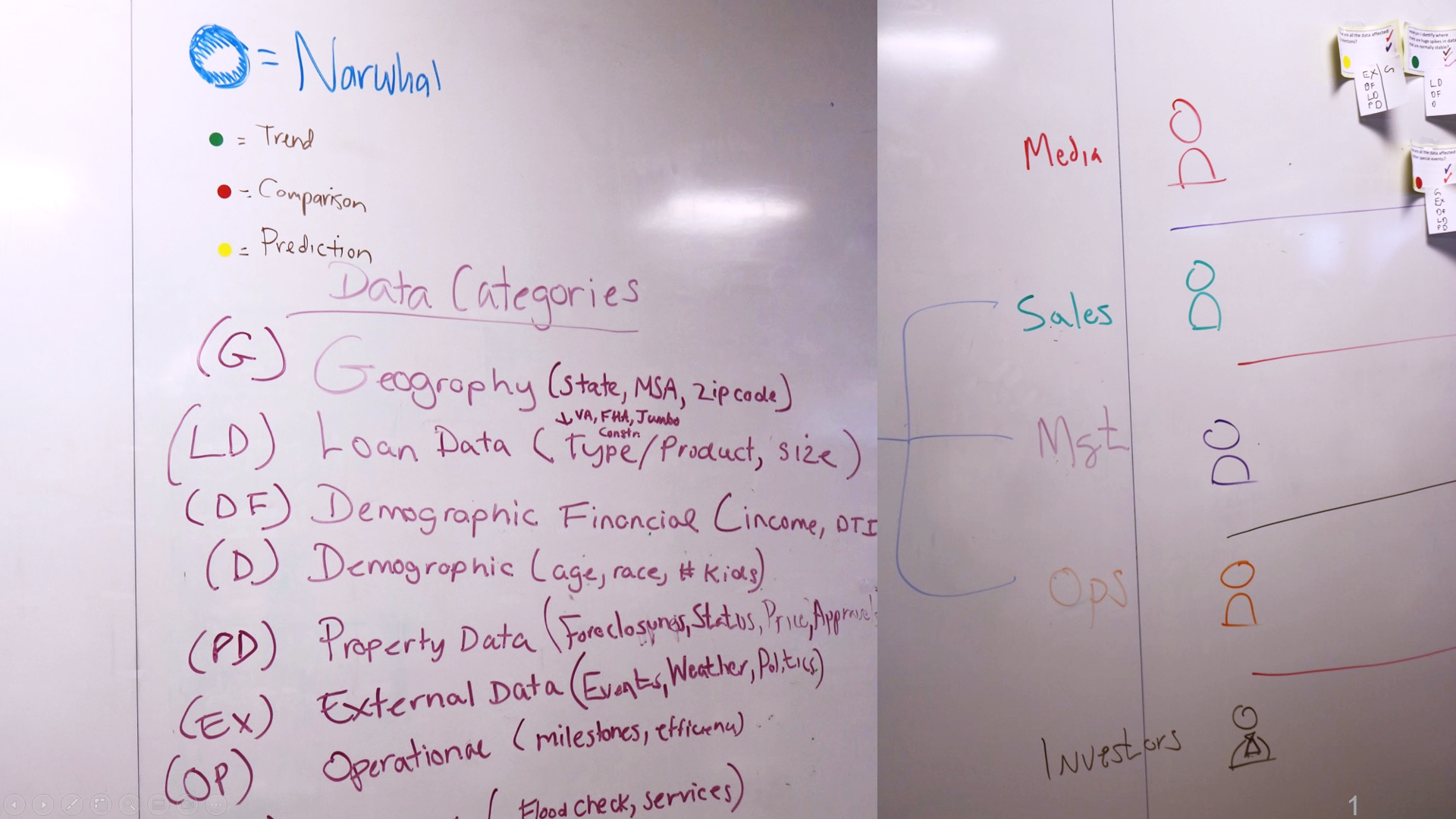
From there, Kathi and I held workshops with the team, including product management, subject matter experts, and engineering to classify the data.

This resulted in three aspects we could use to make decisions: the data needed, the users a question would appeal to, and whether the question would be a trend, comparison, or prediction.
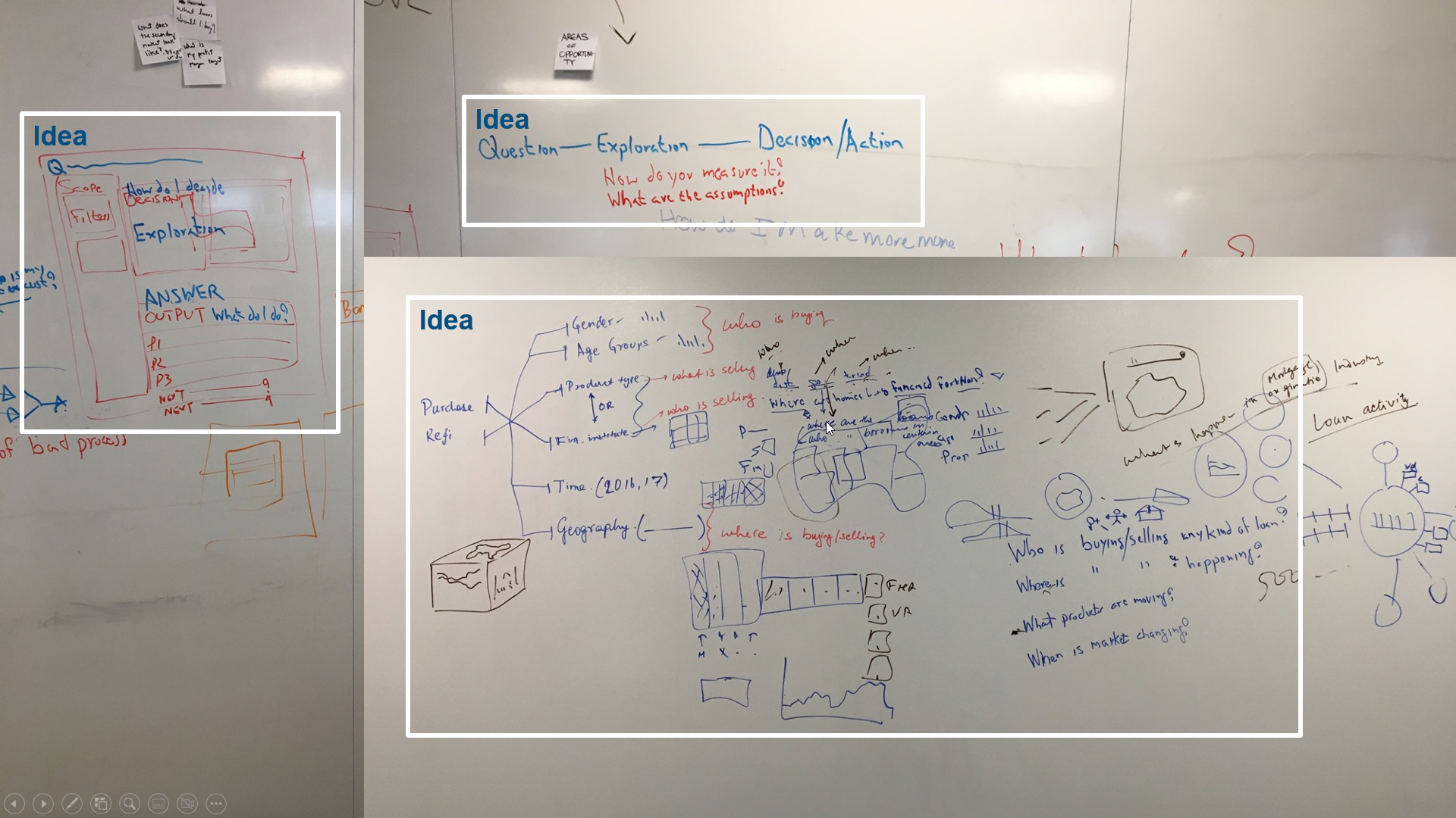
We then spent a workshop ideating on the best direction the overall user experience should take. This resulted in an "inquiry" based direction - i.e., Answering specific user comments versus a dashboard or other visualization structure.
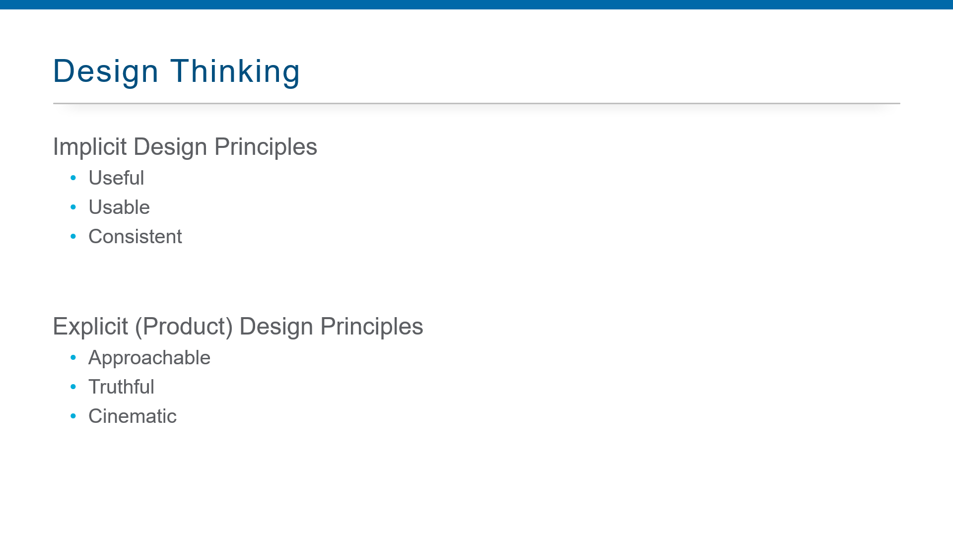
I believe the best designs are created when they are guided by strong principles. While there are implicit ones every digital experience should have, the explicit ones we choose differentiate a product.
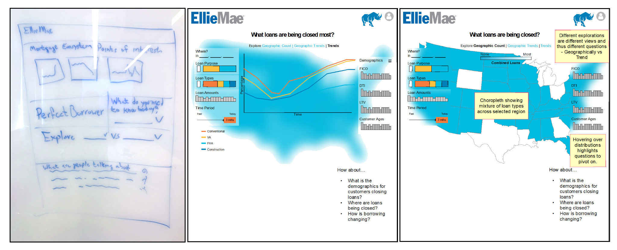
From there, I started wireframing a number of directions. The middle and right ones explored whether we could put controls over the map like a game HUD. In the end, it was too difficult to resolve visual interference issues, and the map had a delineated space.
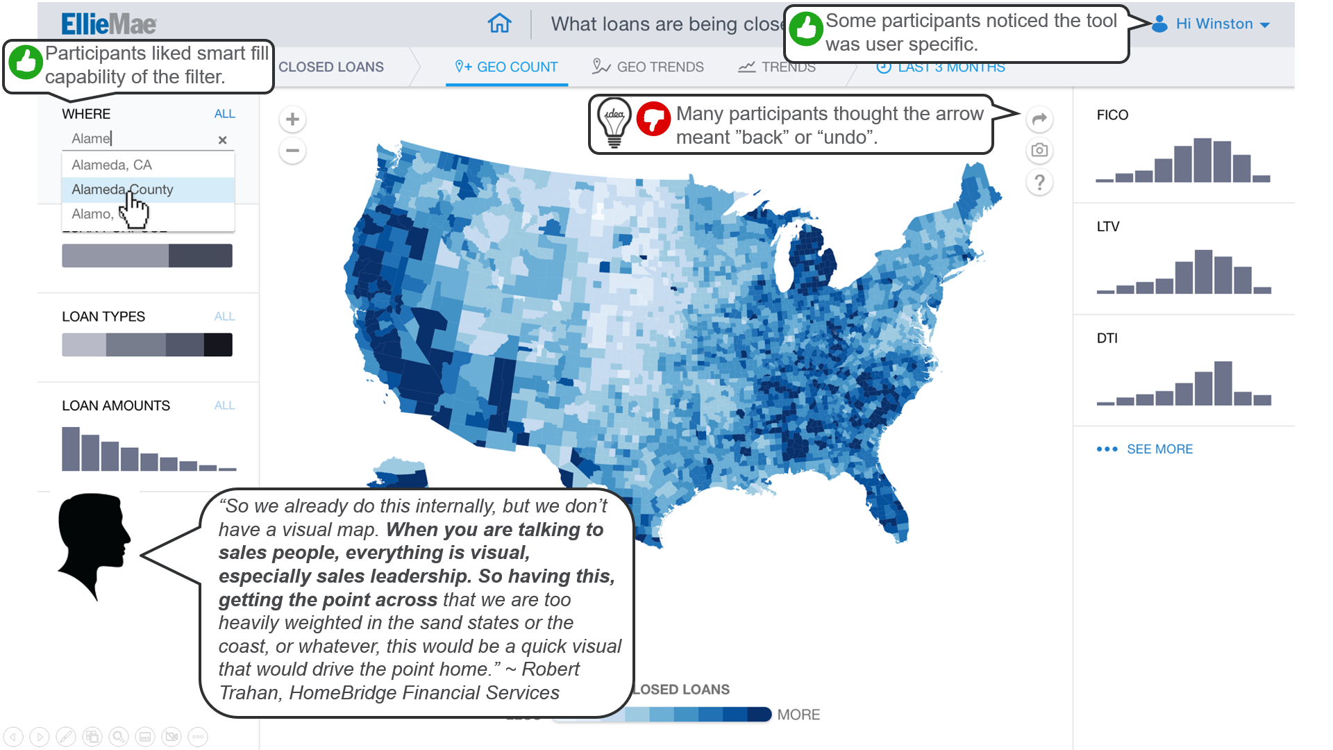
Once high-fidelity wireframes were locked down we took them out to users and tested the design.
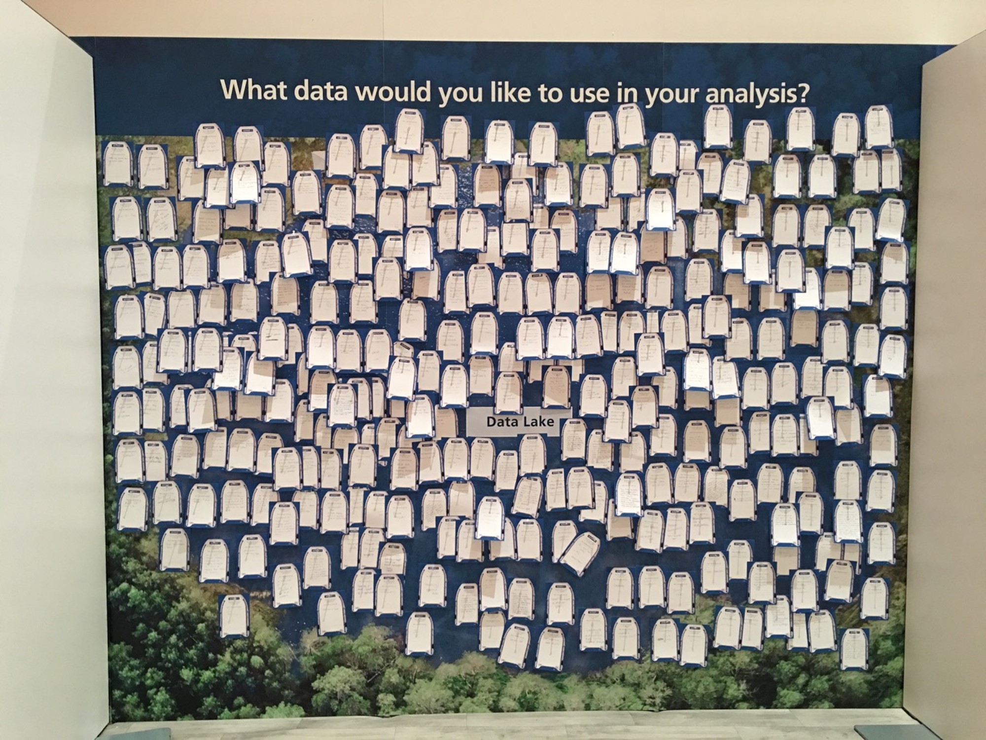
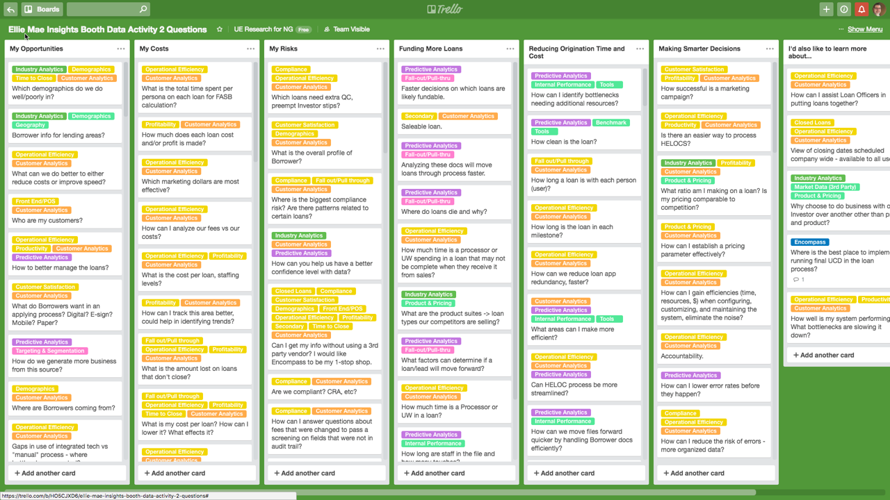
At the conference that we released Insights our booth was set up to gather more of users' analytics comments. Extending the product ended up being difficult because, instead of making all of the components modular as UX asked, they made each page a unit.